
How transparent is UVM’s COVID data compared to other colleges’?
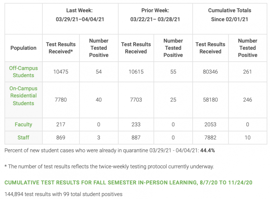
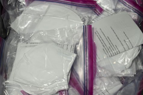
Eight months after UVM created a COVID-19 dashboard to share data on testing and positive cases in the UVM community, administrators have not budged in their decision to only update information once a week.
The Cynic looked at the COVID-19 dashboards of six other colleges and universities—three Vermont schools and three comparator institutions—to compare the information provided by other schools and how often that information is provided.
The Cynic found that five of the six school’s provided more transparent data than UVM, and one provided equally transparent data.
All six school’s looked at provided daily updates on testing, five of them provided some information on the number of students in quarantine and isolation, and two provided information on student sanctions, none of which UVM does.
How does UVM compare to other schools in Vermont?
Saint Michael’s College: More transparent than UVM
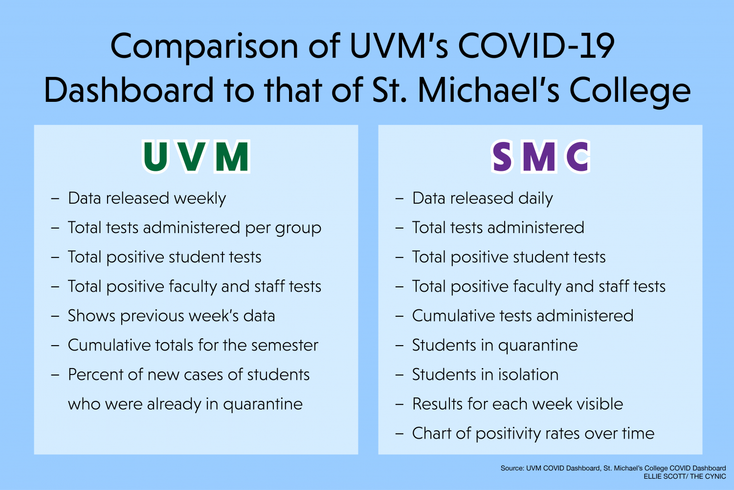
Saint Michael’s College’s COVID-19 dashboard provides the cumulative positive tests administered, cumulative positive cases, as well as the number of students in quarantine and isolation.
According to the dashboard, the information displayed is updated daily in the afternoon or as it becomes available.
In addition to the cumulative number of positive cases and tests administered, the dashboard also includes a graphic breaking down these numbers by week since Jan. 4.
Compared to UVM’s dashboard, Saint Michael’s dashboard provides more information in nearly every category. Unlike Saint Michael’s, UVM does not include quarantine and isolation numbers.
In addition, UVM’s dashboard only includes the number of tests administered in the current and previous week, not every week of the semester.
UVM has also remained steadfast in only updating the dashboard every Monday, whereas Saint Michael’s dashboard states that it is updated daily.
Additionally, the school’s website includes the testing schedule and COVID-19 alert levels, which can vary from green, orange, yellow and red.
Saint Michael’s is located in Colchester and has a student body of 1,600.
“Our contact tracing has been very effective so far this semester,” Alessandro Bertoni, director of marketing and communications stated in a Mar. 21 email. “We are isolating positive student cases in a specific residence hall in order to keep them away from the student body.”
Testing protocol for the semester has been successful since the school has been able to isolate and track positive cases quickly, and had a smooth arrival testing process, according to the same email.
Last semester, Saint Michael’s was forced to shut down campus and transitioned to fully remote learning after 29 students tested positive, according to an Oct. 27 Cynic article.
Before this outbreak, students on campus were getting tested once every three weeks, allowing 500 of roughly 1,500 students to be tested each week.
Now, students are required to test once a week every week.
Champlain College: Equally transparent to UVM
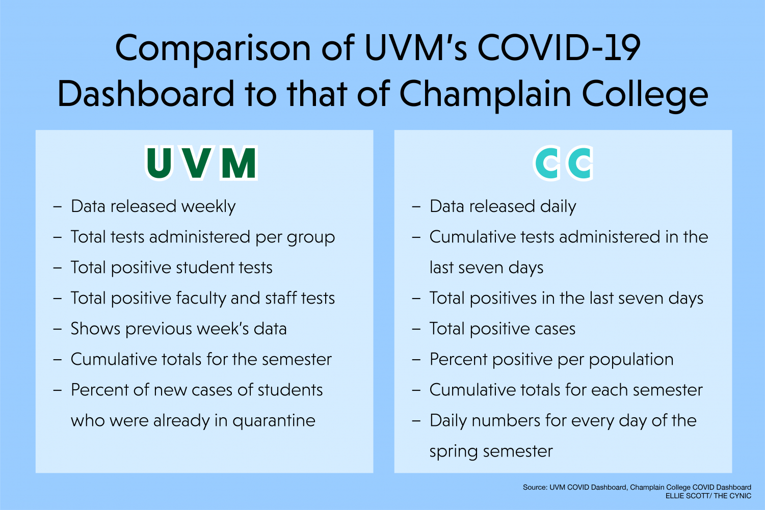
Champlain College’s COVID-19 dashboard features how many tests were administered, the number of positive cases and the overall positivity rate.
The dashboard also breaks down what percentage of cases are coming from students and what percentage are coming from faculty and staff. However, the dashboard does not specify how many tests are administered to students versus faculty and staff.
According to the dashboard, data is updated as results become available, typically within 48-72 hours of testing.
Information on cases and tests conducted is split into four categories: the last seven days, spring semester, fall semester and total tests.
Champlain College’s dashboard includes similar information to UVM’s but is updated more frequently—as results come in— in contrast to UVM’s weekly update.
Just off of Main Street in Burlington, Champlain College sits less than a mile away from much of UVM’s Central campus.
“Champlain’s approach to managing the COVID-19 crisis has been firmly rooted in protecting the health and safety of our students, faculty, and staff as well as that of the broader Burlington community,” stated Leandre Waldo, Champlain’s director of client services and media relations.
President Benjamin Ola. Akande began posting updates on the school’s website in July 2020, that included end-of-semester plans, testing protocols and updates about the pandemic, but it has not been revisited since fall 2020.
The school’s website also includes updates regarding COVID-19 in terms of student affairs, residential life and student health.
Here students and staff can expect to find information as to how student life and testing protocols will play out throughout the semester.
Waldo also stated that the school initiates weekly testing for students, contact tracing and an outlined isolation and quarantine process for students who test positive.
Middlebury College: More transparent than UVM
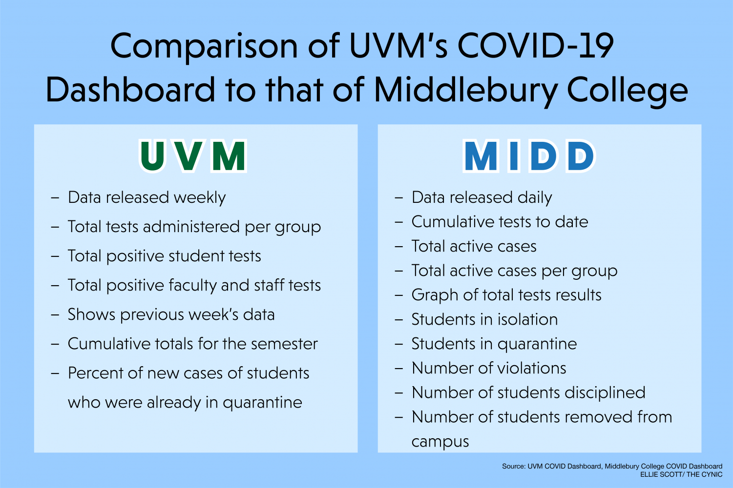
Middlebury College’s extensive COVID-19 dashboard includes information on tests administered and positive COVID-19 cases, as well as the number of students in quarantine and isolation and the number of students sanctioned for policy violations.
The website’s testing dashboard shows the cumulative tests completed to date with positive and negative cases, and includes the number of new cases and total active cases. This is accompanied by a line graph that represents the cumulative testing results by each month.
According to the website, data is updated as new test results are available.
Additionally, the dashboard shows the number of substantiated COVID-19 violations, the number of students disciplined, and the number removed from campus over the spring semester.
The website notes that this is all information higher education institutions are required to provide to the state weekly.
According to the website, the school has a color-designed alert system, similar to Saint Michael’s, that gives students and employees the status of the risk level on campus.
Compared to UVM, Middlebury, a school of roughly 2,500 students, provides more transparent data than UVM. It’s testing data is updated more frequently.
Additionally, it includes weekly updates on students sanctioned, which UVM has only provided upon request.
How does UVM compare to its comparator and peer institutions?
Syracuse University: More transparent than UVM
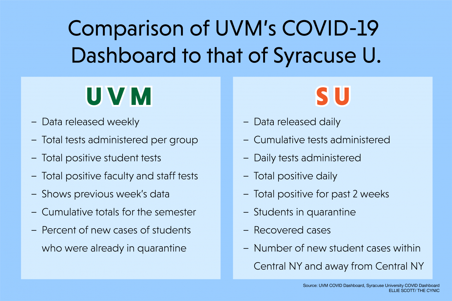
Syracuse University in upstate New York provides daily updates on positive student and employee cases and the number of tests conducted.
Their dashboard, which includes four graphs, breaks down the number of recovered versus. active cases by day since August 2020.
This is further divided into two graphs that break the information down by students and employees, including the number of new cases among the two groups.
Beneath the graphs, Syracuse also provides the number of students currently in quarantine, the total tests administered, the total positive tests within the past 14 days and the total number of recovered cases.
Compared to UVM, Syracuse’s dashboard provides more frequent and extensive information. The dashboard provides daily data since the beginning of the semester and states the number of students in quarantine.
It also shows how many students were tested each day, whereas UVM’s only shows a cumulative total for the week.
Syracuse broke their testing up into six different categories: three revolving around the students, and the other three categories targeting the Faculty and Staff.
Students who do not comply with these orders are subjected to punishments varying mild to severe. Some of which are not being able to access Syracuse servers until you get tested or as egregious as suspension.
Boston University: More transparent than UVM
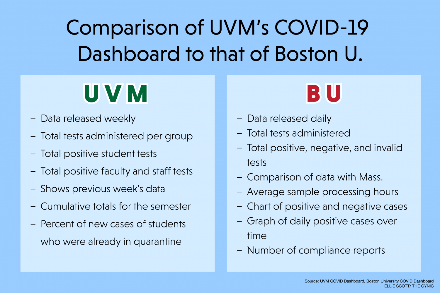
Boston University’s COVID-19 dashboard includes daily updates on the number of positive cases among students and faculty and staff, as well as the number of tests conducted each day.
BU’s dashboard shows a weekly snapshot of how many test results were received each day and how many came back positive. It further provides a break-down of the day’s cases, stating the percent positivity rate.
The website also displays a graph showing how many positive results were received every day since July 27, 2020.
At the bottom of the dashboard, the number of current students in isolation is provided as well as the number of recovered students.
The dashboard includes a “Comparative Statistics” section, that includes the number of tests conducted and percent positivity rate for local counties and the state of Massachusetts.
Each week, BU also releases compliance numbers, which break down statistics on how students are following COVID-19 safety policies.
Included are the number of students sanctioned, the number of warnings issued for students missing or failing to schedule COVID-19 tests and the number of reports of noncompliance for face coverings, physical distancing and campus gatherings.
Compared to UVM, BU provides more frequent and extensive COVID-19 data. Unlike UVM, BU provides daily updates on positive test results as well as tests conducted, the number of students in quarantine and isolation, comparative statistics and compliance reports.
BU, which has a population of roughly 35,000took the same approach as other schools and broke up their testing into categories.
Students who attend classes must test twice a week and report symptoms daily, but for off campus remote students, testing is not required.
University of Connecticut: More transparent than UVM
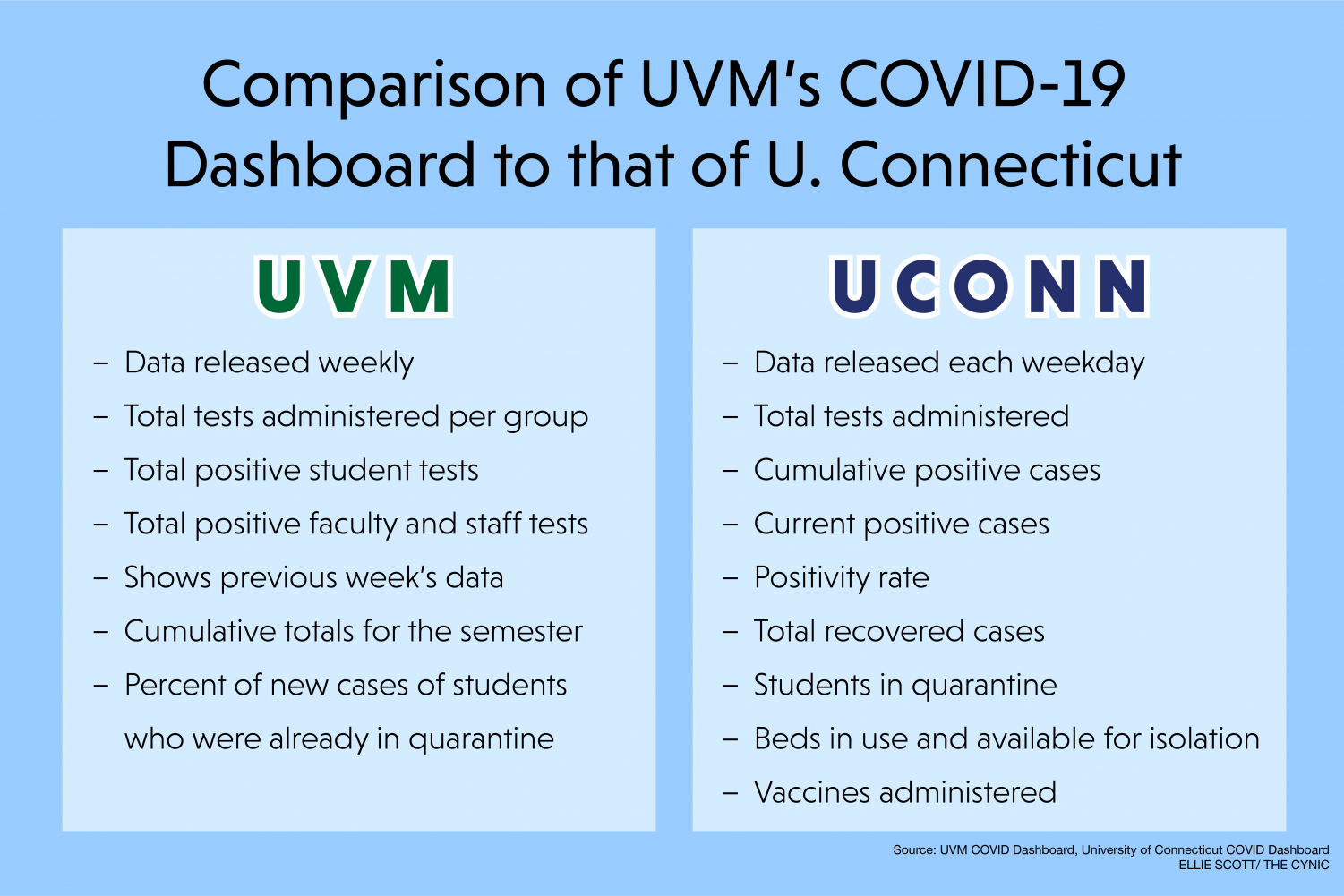
The University of Connecticut’s COVID-19 dashboard, updated every weekday, includes current and cumulative positive cases, percent positivity rate and the total number of test results received.
This data is broken up into six groups for the school’s five campuses and the faculty and staff.
The dashboard also provides a separate document that includes how many students tested positive every day of the spring semester and how many test results were received that day.
In addition to case numbers, the dashboard also includes the total number of isolation beds on each campus, the beds in use and the beds available.
UConn is additionally running its own vaccination site.he dashboard reflects the number of students who have received their first dose, students who have received their second dose and students who have been compliant with vaccine reporting requirements.
Similar to other colleges, the dashboard includes a color-coded alert level for the school’s most populated campus.
The alert levels indicate the level of risk at a given time and the associated influencing factors, possible outcomes and duration.
Compared to UVM, UConn provides more COVID-19 information. In addition to daily updates, a day-by-day record of positive cases, current positives and total positives, their dashboard provides isolation and vaccine data.

(She/her)
Ellie is a senior public communication major from Manchester, CT. Ellie is also an accelerated Master of Public Administration student. This...